Nowadays, most people consider interior design to be purely based on their aesthetic choices. Well, in fact, it’s a powerful means that influences the way one thinks, feels and behaves in daily life. In this context, color proves to be one of the most influential elements that positively affects your mood, ambience and overall feel when it comes to home interior design . This is one major reason why you need to select the right color palette for home. That’s for creating spaces that rightly align with your emotional needs and lifestyle. Picking cohesive color schemes won’t be a daunting task when you know the essential interior design color tips. The 3-colour rule is for you. It’s a simple and effective guideline for creating balanced and visually appealing spaces. This blog will tell you how to carefully choose dominant, secondary and accent colours. So read on.
Understanding the 3-Color Rule in Interior Design
The 3-color rule is simply a fundamental and effective guideline that simplifies your process of choosing colors for Home interior design . It says use one dominant color (70%), one secondary color (30%) and one accent color (10%) for adorning balanced interiors.
Why It Works?
These days, the 3-color rule is becoming touted as one of the main interior design basics that helps to create beautiful interior spaces. Besides adding to the visual charm, there is more to it. Color theory happens to be a discipline that helps you to explore how different colors blend and how they can positively affect human perception.
Color preferences are indeed mostly subjective. However, you can still observe universal associations linked with different color tones. For instance, warm tones like yellow and red stimulate and energise. On the other hand, milder tones like light green and blue have a soothing effect on the onlookers. By having a controlled color palette in your home with the 3-color rule, you can make even the complex rooms look more cohesive, which will look more inviting and calming.
Choosing Your Color Palette
Understanding color theory helps a lot with colour harmonisation for your interiors. Choosing your right color palette will have a direct influence on your moods and pretty much adds up to the ambience of your interiors. Given below are some of the finest tips advised by interior designers when it comes to selecting the right dominant, secondary and accent colors for your home:
Dominant Color (70%)
The dominant color happens to be the primary color that helps you create a good mood and the overall tone of any room. Usually, it covers almost 70% of the given space and is mostly used for walls, flooring and large furniture pieces. For instance, a light blue or soft cream serves as a neutral backdrop.
Secondary Color (30%)
The secondary color can be used for up to 30% of your room as it is effective in adding more depth and visual interest. You can see that the secondary color always complements the dominant color and is found in smaller furnishings, window treatments and upholstery. The main point of using secondary color is to enhance the visual charm of the dominant color and not to overpower it. For instance, a rich plum color can look really good with beige backdrop.
Accent Color (10%)
The accent color takes up the rest of the 10% of the space. Accent color should be used in minimal doses to add extra visual interest for the onlookers. Looks best on your decorative items such as vases, artworks and throw pillows in the room. Being more vibrant and bolder, accent colors prove to be attention grabbers and helps you to add more character to the space. Deep reds and exciting orange tones are often considered as effective accent tones against both dominant and secondary colors.
One of the greatest advantages of going by the 3-color rule is that you get to enjoy simplicity, cohesion and flexibility, all at one go in your interior spaces. The 3-color rule also helps in creating harmony, makes your rooms more inviting and avoids visual chaos.
Color Psychology and Mood Setting
Though the 3-color rule proves to be a popular technique, you can see that there are no hard and fast rules as such. An interior designer can break down the rules to create a unique blend of colors. These colors will effectively influence your mood and enhance the overall ambience in each room.
Warm vs Cool Colors
You can go for warm tones like red, orange and yellow for energising your home interior spaces. On the contrary, you can opt for cool, mild colors such as grey, green and blue as these hues help you to enjoy a relaxed and calm home environment.
Matching Colors to Room Function
There is no doubt that the use of too many colors can spoil the look and feel of your interiors. Therefore, if you prefer to opt for bold accent hues, you can combine them with muted main hues. At the same time, neutral colors can have that extra vibrance when blended with dashing colors. The main point is to match colors according to the specific purpose and functions of your rooms.
Applying the 3-Color Rule in Different Rooms
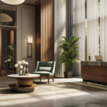
Living Room
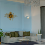
You can use shades of white, yellow and blue for your beach-themed living room. As per the 3-color rule, you can use dominant colors for neutral walls, secondary colors for your sofa set or floor rug, and accent colors for plush pillows and artwork. Additionally, you can try using different accent colors to draw special attention.
Bedroom
You can combine light grey, pink and dark grey to adorn a cosy cottage-styled bedroom. As per the 3-color rule, you can use dominant calming wall color, secondary colors for your bedspread or curtains, accent colors for lamp shades and cushions.
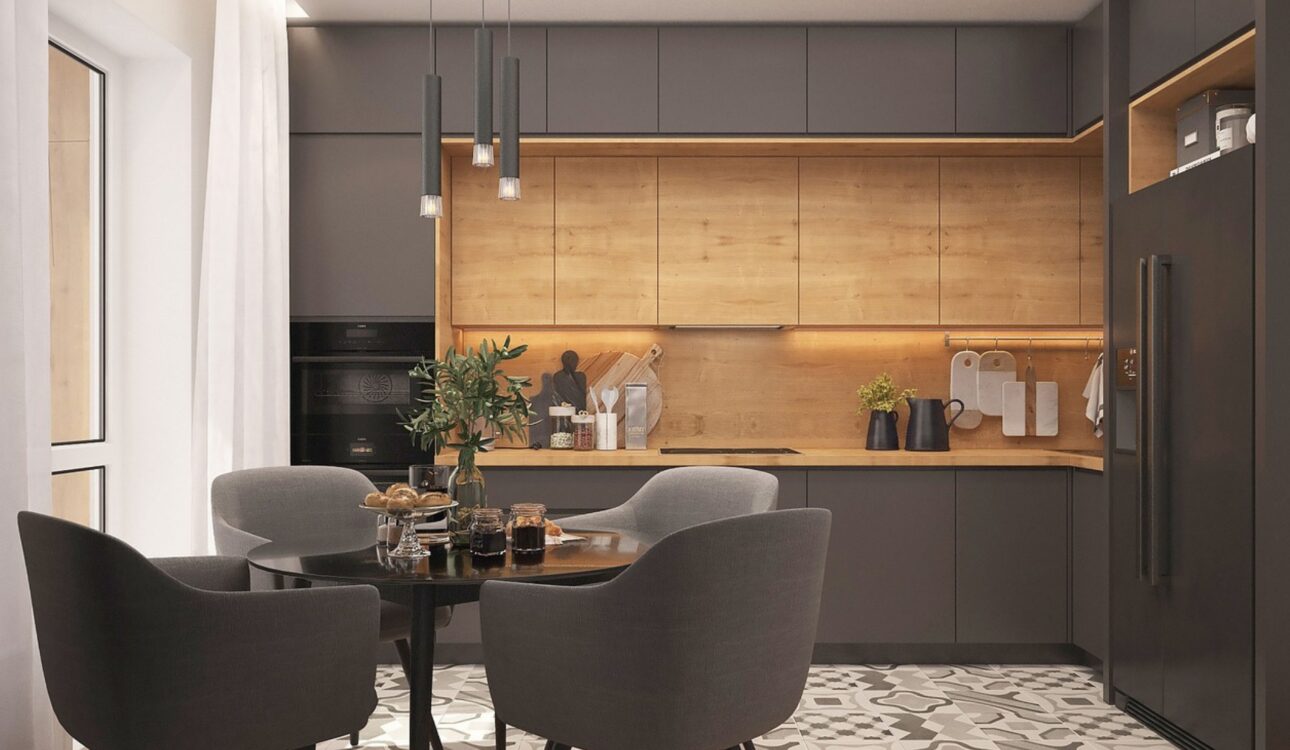
Kitchen and Dining Area
Pairing cream, green, yellow and brown will be effective for your kitchen. As per the 3-color rule, you can use dominant colors for cabinet or kitchen walls, secondary colors for countertops or backsplashes and accent colors for small appliances and designer cutlery.
Practical Tips for Applying the 3-Color Rule
As one of the best interior design tips for homeowners, always keep in mind that the first or dominant color you prefer to use is your main color, the secondary color is also prominent but not in the same way as the dominant color and the third or accent color is used for coloring up little spaces/objects in your room interiors. Given below are some of the practical tips for applying the 3-color rule.
Mixing Patterns and Textures
Maintaining the natural flow of colors is most important, and you should be careful in selecting the color tones when you want to combine patterns and textures. It would be visually much appealing when you combine dominant stripes, florals and geometrical patterns with your secondary and accent colors. You can also consider adding more textures without having to add extra colors.
Using Neutrals and Bold Accents
You can experiment with neutrals for both dominant and secondary colors. Besides that, you can go for bold hues for your accent items and prevent spaces, so that they don’t appear to be cluttered.
Avoiding Common Mistakes
Never overdo colors for any room, as it can look so underwhelming. Never opt for accent colors in large spaces. Always go for the 3-color rule by having an exact idea and purpose of the space you want to color and beautify.
Benefits of Following the 3-Color Rule
One of the most significant benefits of following the 3-color rule is that homeowners like you will be able to create an aesthetically attractive and cohesive design for your interiors. However, you should be thoughtful when you select and combine the three complementary colors. The creative application of these colors will certainly provide you with the desired results. Given below are the other main advantages of following the 3-color rule:
- Helps you to create visual balance and harmony
- Makes decorating your interiors more cohesive and easier
- Enhances mood and function of every room
- Simplifies furniture and décor selection and helps you to maintain style
Conclusion
The 3-color rule is central for home interior design. It helps you create balance and harmony along with providing a classy look for your spaces. All dominant, secondary and accent colors help you to add more depth and structure to your interiors. The best part is that the 3-color rule is flexible for home interior design. It is in fact the fundamental framework principle that you can use to create exceptionally beautiful and inviting home spaces. Whether you are designing a cosy living room in Kochi or refreshing your entire home, following the 3-color rule can help you achieve a stylish and harmonious space. For expert guidance contact a professional interior designer. Call Atlas Interiors now and get ready to transform your interiors in the most beautiful way.
FAQs
1. What is the 70-30-10 rule in color selection?
The 70-30-10 in color selection is 70% of dominant color, 30% of secondary color and 10% of accent color.
2. How do you make use of the color theory?
You can use the color theory, get inspired and blend colors to form dominant, secondary and accent colors to beautify your home spaces.
3. What is the finest color combination for home interior design?
The finest or best color combination actually depends on your personal preferences and mood. Classic combinations include grey and yellow to flaunt a modern cheer or you can try blending white and blue for a coastal feel. Experimenting is key here.
4. What is the greatest advantage of using the 3-color rule?
You will be able to create visually charming and cohesive home interiors
5. Does the 3-color rule help you to enhance home interior design?
Yes, surely it helps you to create exceptional home spaces that are both beautiful and practical.