Walk into any beautifully designed home and you will feel something before you consciously notice anything. A sense of calm washes over you in a sage-green bedroom. An amber kitchen feels alive and inviting at breakfast. A navy study commands focus. This is not coincidence — it is color psychology at work, and it is one of the most powerful tools in the hands of any skilled interior designer.
Color is the first thing the human eye registers in a space. Before you notice the furniture, the textures, or the architectural details, your brain has already processed the dominant hues and begun forming an emotional response. This is precisely why the best interior designers treat color not as decoration, but as the foundational language of a space — one that shapes mood, perception of size, and even the behaviour of the people who live there.
“Color is the first element of design that speaks — before furniture, before form, before anything else.”
Why color matters more than most homeowners realise
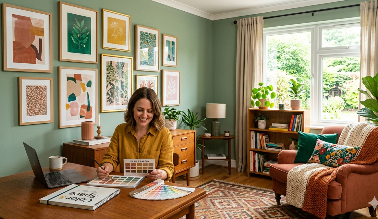
Most homeowners choose colors the way they choose curtains — based on what looks pretty in a swatch book. But color in a room is a profoundly different experience from color on a chip. Natural light shifts it through the day. Artificial light transforms it at night. Adjacent materials amplify or neutralise it. A color that feels warm and gentle in a north-facing room becomes harsh and intense on a south-facing wall in afternoon sun.
Understanding these dynamics is what separates a professionally designed interior from one that simply has nice paint. The best interior designers invest significant time understanding how a client lives in each room — when they use it, what activities happen there, how much natural light enters — before a single color decision is made. This process, often invisible to the homeowner, is what makes the result feel effortlessly right.
A room-by-room guide to color psychology
Different colors carry distinct psychological and emotional properties. Here is how leading designers think about color assignment across the key rooms of a home:
| Palette | Psychological effect | Best rooms |
| Warm whites & sand | Inviting, expansive, timeless. Makes spaces feel larger and luminous. | Living room, Entryway |
| Sage & forest green | Restful, grounding, connected to nature. Promotes calm and restoration. | Bedroom, Study |
| Deep blue & navy | Focused, authoritative, intellectually stimulating. Encourages concentration. | Home office, Library |
| Terracotta & rust | Warm, energising, convivial. Stimulates appetite and conversation. | Kitchen, Dining room |
| Dusty lavender | Soothing, creative, gently luxurious. Supports relaxation and creativity. | Bedroom, Bathroom |
| Deep forest & charcoal | Dramatic, cocoon-like, sophisticated. Creates intimacy and visual depth. | Media room, Bar area |
The living room: setting the emotional tone
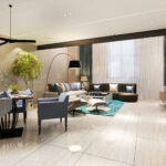
The living room is where color has its greatest responsibility. It is the space that greets guests, accommodates the whole family, and transitions between day and evening. Warm neutrals — sand, warm white, greige — remain the most enduringly successful foundation for living rooms because they are permissive: they let furniture, art, and accessories tell the story. But the best interior designers rarely stop at neutral walls. They layer in color through textiles, cushions, a statement sofa, or a single feature wall that introduces a deeper, moodier hue without overwhelming the space.
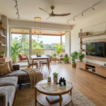
Bedrooms: designing for rest
Sleep science and color psychology agree: bedrooms benefit most from cool, muted, desaturated hues. Sage green, soft slate blue, warm lavender, and dusty rose all perform well as bedroom colors because they lower visual stimulation and signal the nervous system to decompress. Avoid strong reds, bright yellows, or intense oranges in bedrooms — even when they feel exciting in a showroom, they tend to disrupt sleep quality over time. Instead, use warm accent lighting to bring energy to the space when needed, without committing it permanently to the walls.
Kitchens and dining spaces: appetite and energy
Kitchens are among the most creatively exciting rooms to colour because they benefit from warmth and energy. Terracotta, deep olive, rich navy, and warm forest green are all strong performers as kitchen cabinet colours in 2026. The best interior designers approach kitchen color by separating the cabinetry palette from the wall and countertop palette, creating a layered composition rather than a single monolithic color statement. In dining rooms, slightly saturated colors — warm amber, antique red, deep teal — have been proven by studies to stimulate conversation and appetite.
“The best color schemes are not the loudest — they are the ones you stop noticing because the room simply feels completely right.”
The 60-30-10 rule: the professional’s color framework
This rule is the cornerstone of balanced, professional color design — and one of the most useful frameworks any homeowner can learn:
| 60% | Dominant color | Primary wall and floor color. Usually neutral. Sets the room’s mood without demanding attention. |
| 30% | Secondary color | Furniture, large textiles, and cabinetry. Complements the dominant color and adds visual interest. |
| 10% | Accent color | Cushions, art, plants, lamps, and hardware. The most saturated, personal element — the room’s signature. |
The golden rule: never use more than three distinct colors at any one level. Complexity at the accent layer is fine — at the dominant level, it creates visual chaos.
Light: the silent modifier of every color
No conversation about interior color is complete without addressing light. The same paint color behaves fundamentally differently under north-facing daylight, south-facing afternoon sun, warm halogen light, and cool LED lighting. This is why professional color consultation always involves placing paint samples in the actual room, at multiple times of day, before a final decision is made. The best interior designers work with lighting designers in parallel on larger projects precisely because a beautifully chosen color can be entirely undone by the wrong light temperature.
Professional color selection tips
- Always test paint samples in the actual room — never rely on a swatch book alone
- Observe the sample at morning, midday, and evening under both natural and artificial light
- Paint a large A3 or A2 card rather than directly on the wall — you can move it around to compare
- Choose your lighting color temperature before your wall color — warm bulbs (2700K) suit earthy palettes; cool bulbs (4000K) suit blues and greys
- Remember that colors always look more intense on four walls than they appear on a small swatch
Dark and moody interiors: the case for going bold
One of the most significant shifts in interior design in recent years has been the embrace of dark, deeply saturated wall colors. Forest green, midnight navy, charcoal, and even jet black are now found in living rooms, bedrooms, and home offices around the world — and when executed well, they create a sense of cocooning warmth and sophisticated drama that no pale wall can replicate.
The key is commitment: dark colors work best when applied to all four walls and the ceiling, not just one feature wall, which tends to look awkward and unresolved. Pair dark walls with warm, layered lighting and natural textures — linen, rattan, leather, wood — and the result is nothing short of extraordinary.
Color trends for 2026: what the best designers are choosing
In 2026, the dominant color story in residential interiors is one of earth and restraint. The frenetic color maximalism of the post-pandemic years has given way to a quieter, more considered palette. Warm whites with clay undertones are replacing the cool, blue-tinted whites that defined the last decade. Deep forest greens continue their run as the decade’s most enduringly stylish interior color. Terracotta and rust are being used with more sophistication — as furniture upholstery and cabinet colors rather than wall paint. And across price points, the best interior designers are bringing in color through art, ceramics, and textiles rather than the walls themselves — a more flexible approach that allows a home to evolve without a complete repaint.
Frequently Asked Questions
Q1. What colors make a small room look bigger?
Light, warm neutrals — warm white, pale sand, soft greige — are the most effective at making a small room feel larger. The key is choosing warm-toned whites rather than cool, blue-tinted ones, which can feel stark and clinical. Painting the ceiling the same color as the walls — or slightly lighter — also removes the visual boundary that makes ceilings feel low. Mirrors and reflective surfaces amplify this effect further. Avoid dark or saturated colors in genuinely small rooms unless you deliberately want a cocooning, intimate atmosphere. Glossy or satin finishes also reflect more light than matte paints, subtly enlarging the perceived space. If you prefer to use a stronger hue, restrict it to one focal wall and keep the remaining three walls in a soft, light neutral to maintain visual openness. Consulting the best interior designers in your area can help you identify the precise shade that works best for your room’s orientation and light quality.
Q2. How do I choose the right color for my living room?
Start with the room’s orientation and light. North-facing rooms receive cool, indirect light — they benefit from warm-toned colors that compensate for this. South-facing rooms get warm afternoon sun — they can handle cooler or more saturated hues without feeling cold. Then consider how you use the space: if your living room is primarily for relaxing, muted tones and cool greens work well. If it is a social, energetic space, warmer hues like terracotta or amber create a convivial atmosphere. Always test paint samples at multiple times of day before committing. Consider your existing furniture and flooring — your wall color should feel like the final layer of an already-coherent composition, not an afterthought. If you have warm-toned wooden floors, lean into that warmth with earthy wall hues. For contemporary grey stone floors, explore cooler greens or dusty blues. Working with the best interior designers for your region ensures all these factors are assessed professionally, taking the guesswork out of one of your home’s most impactful decisions.
Q3. Is it a good idea to use dark colors in a bedroom?
Yes — but with care. Deep, moody colors like forest green, navy, and charcoal can create a wonderfully cocoon-like bedroom atmosphere that is deeply restful. Research in environmental psychology suggests that darker, enveloping spaces can lower cortisol levels and promote deeper relaxation before sleep. The key is to ensure the room has warm, layered lighting to counteract the visual weight of the dark walls, and to use light-colored bed linen and natural textures like linen, cotton, and wood to keep the space from feeling oppressive. Fresh white or cream bedding against a dark wall creates a striking, hotel-like contrast that never fails to look luxurious. Avoid using dark colors in bedrooms that receive very little natural light, as the combination can become genuinely gloomy rather than dramatically cosy. In rooms with good natural light, however, deep wall colors are among the most rewarding choices the best interior designers can recommend.
Q4. What is the 60-30-10 color rule and should I follow it?
The 60-30-10 rule is a professional color-balance principle where 60% of the room’s color appears in the dominant tone (walls and floors), 30% in the secondary tone (large furniture and textiles), and 10% in the accent color (cushions, art, plants, and accessories). It is a genuinely useful framework because it creates visual balance without rigid restriction. You do not need to follow it mathematically, but understanding its logic — dominant calm, secondary interest, accent personality — helps you make confident color decisions. The most common mistake homeowners make is inverting the rule: using a bold, intense color on the walls (the 60% zone) and relegating neutrals to the accessories (the 10% zone). This approach tends to feel overwhelming and dated quickly. The best interior designers use the 60-30-10 rule as a starting framework, then break it intentionally for specific dramatic effects — but always with a clear understanding of what they are departing from and why.
Q5. How often should I update the color scheme in my home?
There is no fixed rule, but most design professionals suggest revisiting your color scheme every 7 to 10 years for a full refresh, with smaller accent updates — new cushions, art, plants, or soft furnishings — every 2 to 3 years to keep the space feeling current. A well-chosen neutral base color on your walls can last far longer than trend-driven accent colors, which is why the best interior designers often recommend investing in a timeless, considered wall color and allowing personality to live in the more easily changed elements like textiles and accessories. Rooms that receive daily use — kitchens, hallways, bathrooms — may need a practical repaint every 4 to 5 years simply due to wear, regardless of trend cycles. If your lifestyle or family structure changes significantly — a growing family, a move to working from home, or children leaving the nest — these are also natural triggers for a thoughtful color review, since your rooms should serve the life you are actually living now.